
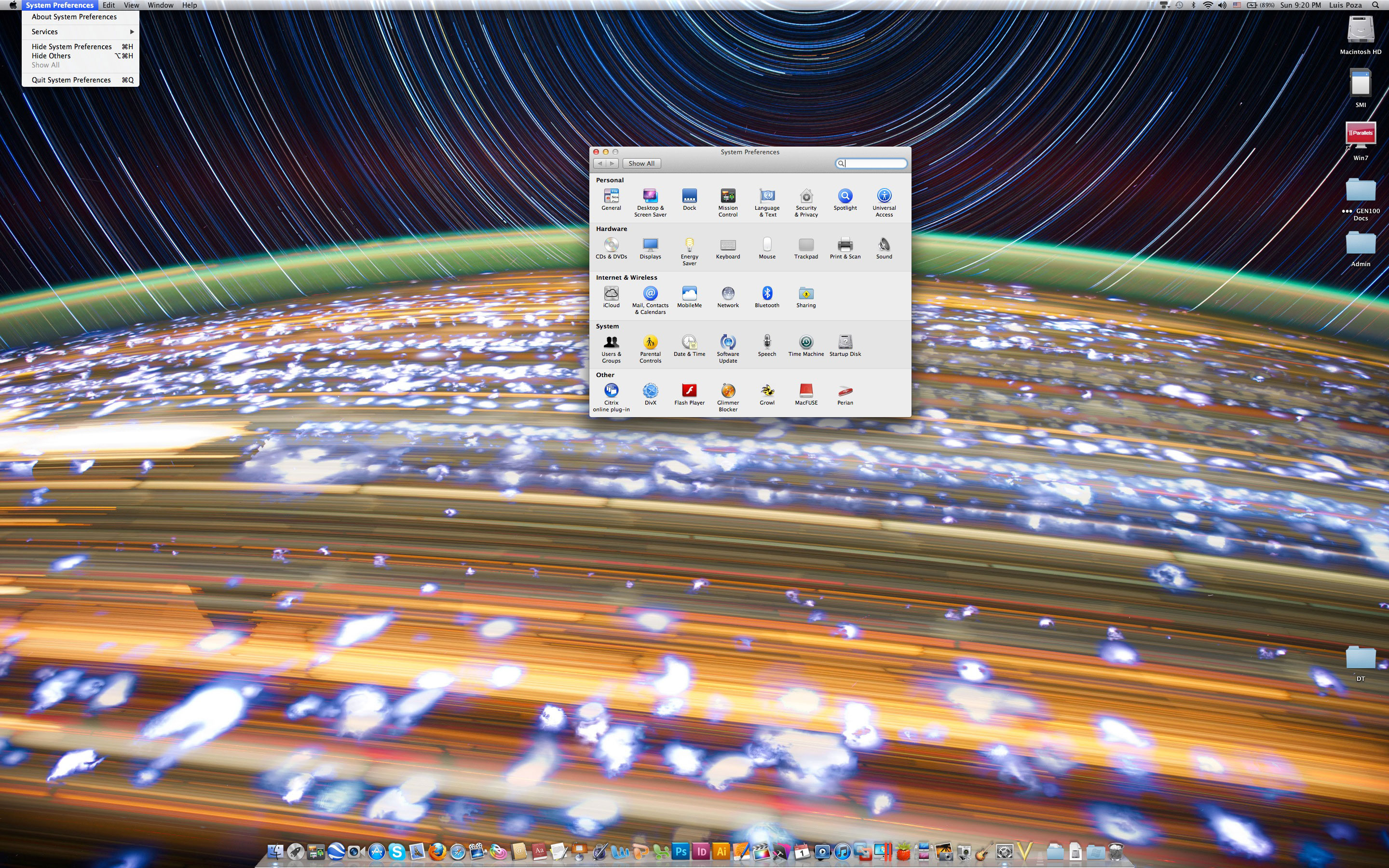
Review: The Retina Macbook Pro
It came a few days ago, and now that I’ve had a bit of time to play around with it, I have some initial reactions.
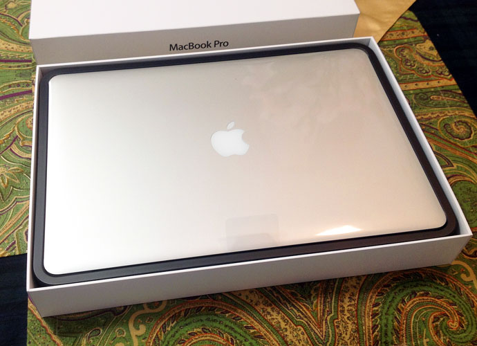
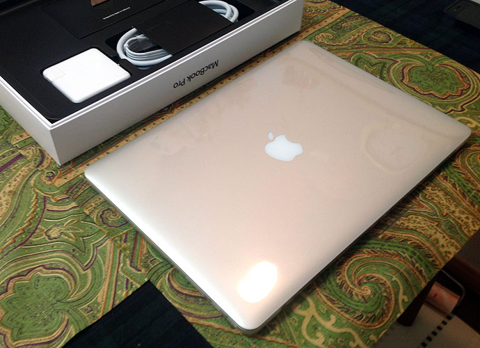
Unboxing Day
As one would expect, it comes beautifully boxed.

Sachi had a few chuckles over my photographing the unboxing; she is not that used to Nerd Pr0n.
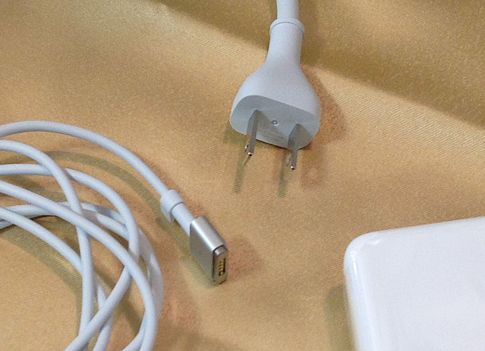
The first thing I noticed is, the power cable is different. There’s the MagSafe 2, and (at least for units sold in Japan) a more streamlined power cable plug.
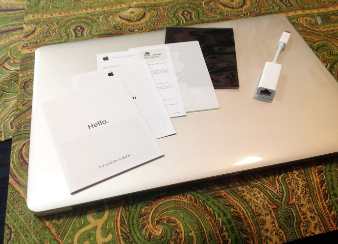
Apple really sees to the details, down to a piece of tissue paper separating the screen from the keyboard, cut in the precise shape. Insignificant, but they take care of details at that level, and it makes an impression (like using Garamond in a resume).

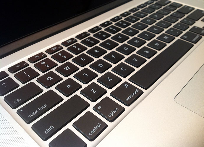
The keyboard is generally the same great-feeling chiclet keyboard, perhaps a bit more subdued than before.

Pixels Painted On
When I got the iPad 3, I was a bit less blown away by the Retina Display than I expected; the screen is great, but not mind-blowingly greater than the previous screens.
The Retina screen on the MBP, however, immediately impressed me. People have talked about things on the screen looking “painted on,” and you do get that impression. Here are a few images at 1380 x 1000 resolution if you click on them:
It’s not just he pixel density, though; the far-richer contrast hits you pretty quickly, too:

As I was setting it up, I took off my glasses and got within a few inches of the screen–and was immediately struck by the fact that you can see the pixels. Yes, I know that the retina display makes the pixels almost invisible at normal viewing distances. However, on my iPad 3, even close-up, it is nearly impossible to see the pixels. Again, I know the density is greater on the iPad (264 ppi for the iPad, 220 for the Retina Pro). Still, I didn’t expect to be able to discern anything visually.
But then I looked back at my late-2008 Pro, and was shocked to see that the pixels were huge. Now, of course, I have been looking at those pixels for four years, and have even noted the pixel grid before–but even after just a few minutes with the new Retina Pro, the older machine’s screen looked much worse than I had recalled.
After using the Retina Pro over the weekend, in fact, I switched back to the old Macbook Pro for a short time–and was even more shocked. Good lord, but those pixels look huge now! I am struck by how strong the screen-door effect is, and have to “get used to” the quality again before it stops bugging me so much.
It really is true–you’re going to have your standards raised so much that older screens will look far worse than you remember them. I heard that would happen, but was rather shocked at how quickly it took place.
Resolutions
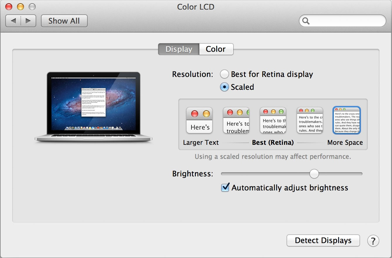
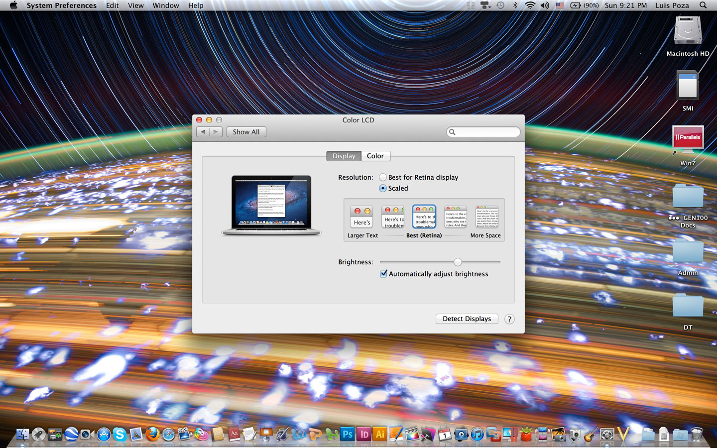
Next comes the screen resolutions. If you have one of these puppies, you’ll want–just for fun, mind you–to download an app called Change Resolution.
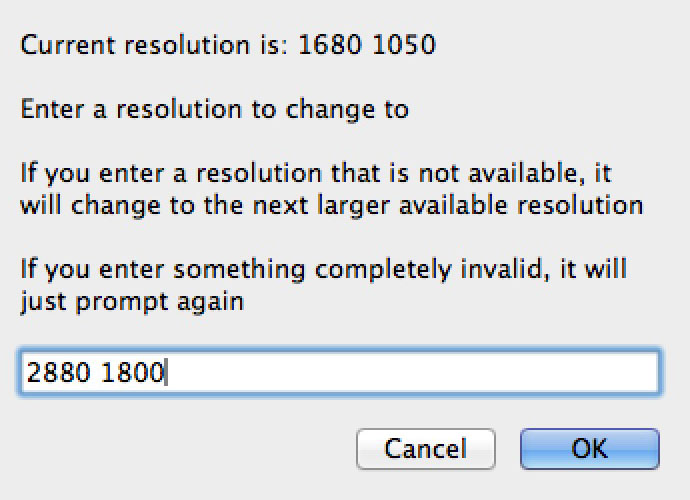
You open up the app, and (in a low-res window!) you can type in the horizontal and vertical resolutions and then click “OK.” Do that at 2880 by 1800, and you get this screen (click for full resolution, file size 1.4MB):
This is the actual size of the screen shot. One thing you will hear is that the Retina Pro creates screen images at double (well, quadruple) the resolution, then down-samples in order to get a more acceptable screen image quality; as a result, screen captures are usually at double the resolution, too. However, this is not the case when you are doing native resolution–the screen shot is at 2880 by 1800. This means that, ironically, at full resolution, the GPU is not working as hard as it is at “lower” resolutions.
As you can see from the image, of course, the elements on the screen become ridiculously small, and while readable, you certainly don’t want to work that way unless you have really unusual needs.
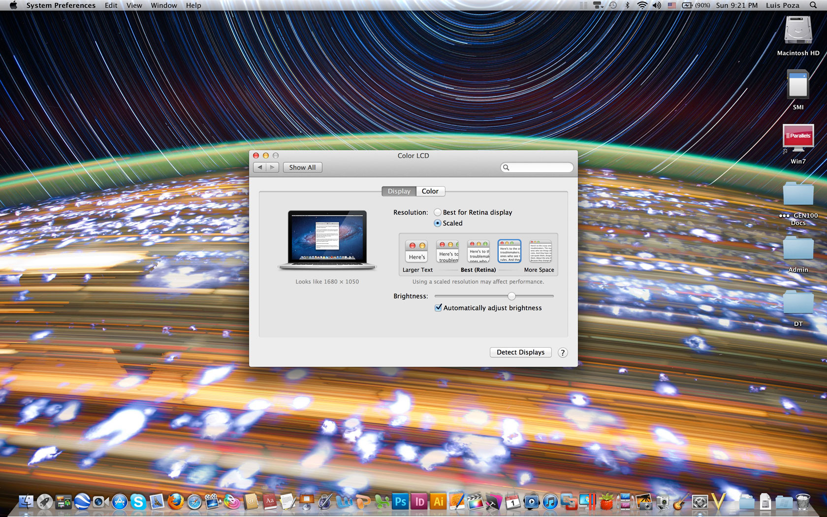
Other resolutions you can work at are, approximated, 1024 x 640, 1280 x 800, 1440 x 900 (the old MBP resolution, exactly half/quarter the new one), 1680 x 1050 (the resolution of the higher-quality screen on the old 15“ models), and 1920 x 1200 (”Full HD“).
Here are screen shots of the five ”normal“ resolutions, scaled to 690 pixels wide (see full-sized on click; I scaled them down from the double/quadruple size of the screenshots to their stated-resolution sizes):
First, 1024 x 640–which I think they included for fun, as who the hell would want this resolution?
Next, 1280 x 800–barely reasonable:
Their ”best“ setting of 1440 x 900, which is OK, but I want more real estate, myself:
Their high-resolution option fitting recent MBP specs, at 1680 x 1050:
And the ”Full HD“ at 1920 x 1200:

I like 1920 x 1200 in terms of how much real estate it gives me, but am still trying to figure out if I can live with how small things get. For example, the images I produced for this post seemed so tiny, I had to check to make sure I didn’t have the image dpi mistakenly set at double. I find myself using the pinch gesture to zoom in on web pages, and often use the zoom feature to see what I am typing better. On the other hand, the zoom feature allows me to zoom in at double size and still looks like almost-native quality, probably due to the double-sampling explained below. It’s so easy to zoom with the Control-Scroll, I am finding it preferable to working with larger-looking elements on less real estate.
When news came out that the 2880 x 1800 setting would be denied to users, there were a lot of shocked reactions. I was disappointed, wanting full control (and subsequently given it by the Change Resolution app). In comment sections on tech sites reviewing the Retina Pro, Mac haters were having a field day, cackling over how we Mac users were getting swindled. That was before it was clear what the deal was really all about.
As stated above, 2880 x 1800 is simply absurd for a 15” display resolution. Apps that can handle it, like games which don’t display text at normal sizes, can claim access to native resolution (i.e., we’re not getting swindled out of pixels), but for normal use, it would be stupid to offer that resolution for your average user.
Additionally, at “lower” resolutions, you are not actually getting “lower” resolutions. It’s always 2880 x 1800. What’s happening is that the approximated lower resolution is produced by the CPU at four times the size (double each dimension), and then downsampled to fit the 2880 x 1800 display. Which means that when you are using the supposed 1920 x 1200 resolution, the quality you see is actually 3840 x 2400 (often referred to as 4K resolution), brought down to 2880 x 1800.
In short, “1920 x 1200” on a Retina Pro is, I believe, a good deal better than 1920 x 1200 on a display with that as the native resolution. Whatever the case, I am still struck by how nice it looks.
In fact, on reflection, I am now certain of it. Take the lowest resolution setting, for example–1024 x 640. If I go down to that resolution on my old MBP (or on any other screen, for that matter), the picture looks fuzzy at best. Not on this display; 1024 x 640 looks as sharp as any other resolution. Meaning that I am not really looking at 1024 x 640 resolution, but simply a 2880 x 1800 resolution which is scaled to look like 1024 x 640. In this case, I guess, 2048 x 1280, which is still better than Full HD, painted onto 2880 x 1800 pixels. However it’s done, it works.
This is a far better improvement (however “apparent” it may be) than I got switching from the old iPad to the new one.
Not Ready for Retina Time?
Many have talked about how bad things look when you are using a non-retina-ready app, but frankly, I don’t see it. Many had posted side-by-side images which don’t show much difference. I thought it was just because you could not see the retina-resolution image at its best, but now I think that it just isn’t nearly the contrast it’s hyped up to be.
Take a look at a small section of a screenshot from a movie at 1080p. The top part of the image is from the movie played in QuickTime Player, which is adjusted to take advantage of the Retina display; the bottom part is the exact same image as shown on MPlayer OSX Extended, an app not so updated:

You can see there is a bit more jaggedness to the lower image–but with the pixels being so small on the Retina Pro, the images above are much smaller, and the jaggedness is much harder to see. In full motion, at normal viewing distances, the difference is negligible if not invisible.
You can notice text when it is not displayed right, but so far, using apps like MS Word 2008, I hardly see any quality degradation, and can use such apps perfectly well, without any discomfort. Probably this is due to font smoothing or some other effect that OS X employs.
Zooming Right Along
Next is speed. Now, I may not be the best judge of this, because my old, late-2008 MBP is not only aging, but it’s been dropped several times more than is good for it. More to the point, my normal way to work is to have 10 or more apps running at the same time, some of them memory hogs (Safari, Parallels running Windows 7, Photoshop), and Lion itself is pretty memory-intensive.
As my old MBP has just 4GB of RAM, and runs on an old Core 2 Duo… well, quite frankly, it was driving me insane. Safari took 24 bounces plus a 5-second wait after that to start. I got the spinning beach ball all the time. All to often, just clicking on a menu would elicit a 5- to 10-second pause. It didn’t help that my trackpad button failed more than a year ago, and a few weeks back the file system index blew a gasket, making content-based searches impossible. It is not an exaggeration to say that I am pretty patient when it comes to this stuff, nor that my patience was stretched to the limit.
The new Retina Pro, even the “lower-end” model I have, is so completely different that it’s not even funny. With an Ivy Bridge quad-core i7 CPU, along with a solid-state drive, this thing just rocks. 16GB of RAM doesn’t hurt, either–I have yet to max out the memory, but have come close, and am very glad I went for the upgrade.
Safari, like almost every other app, snaps open in a single bounce of the dock icon. Windows 7 in Parallels opens from a suspended state in just a few seconds. Photoshop is ready to go almost as quickly as I can be ready for it.
In short, it’s fast. Very nice. Expected, yes–but still excellent.
Closet Space
My main concern was not having enough drive space. If you read my posts from before the release, my main fear was not getting more storage. I was tired of a 250GB drive, and was very unhappy at the prospect of the new Pros falling back to my low capacity, after having reached 500 and 750GB previously. Alas, without paying gobs more than it’s worth for the higher-end Retina Pro, you’re stuck with the 256GB SSD.
However, I did have an unexpected revelation: the thing has an SD slot. And it’s SDXC ready, meaning you can stick a 64GB card in there. And Akihabara just happens to have 64GB SDXC cards (albeit off-brand) on sale for ¥2800 ($35). Meaning that, for $140, you could get the equivalent of a 256GB upgrade.
The question was, would it work? People had reported problems with previous SD card use in the Pro line, and I would be using an off-brand type; would it be too slow or wiggy in use? I bought a card (and a cheap portable SDXC reader, for transfer purposes) a few weeks ago so I’d be ready, and have been trying it out.

Long story short: it works. I slip in the card and an icon immediately pops up on the desktop. Data transfer times are not fantastic–a shade better than 10MB per second, not as good as branded cards, or so I read–but it’s good enough for what I want to use it for.
It’s not as good as having a 512GB drive, but it’s well worth the $500 saved, and then some. When I buy three more SD cards, I’ll use, perhaps, one for photos, one for archived documents, one for video files, and probably one for miscellaneous (or another arrangement if I find one that works better).
I’ll have to find the best way to keep them and to cart them around; in the past, I’ve seen small plastic-sheet holders with tiny sleeves for each card, but now that I need one, I can’t find any–all commercially available holders are hard-cover cases or other inconvenient arrangements. I have a snap-button pocket in my wallet I don’t use, which will probably be my solution, but I’ll have to fish around to get the right card.
Whatever I work out, I am pretty sure it will be sufficient for my needs.

Battery
I have read that the battery lasts 7 hours, 5 hours with heavy use. Seeing how the charge dissipates, I am not entirely confident of that assessment, though I have not tested it objectively. After what sure seems like less than 2 hours’ use, I fall below the 50% mark.
On the other hand, the battery measurement algorithm seems a bit off–it appears to charge beyond 100%, and takes a bit to fall below that. Maybe the lower end of the scale will stretch out more, I don’t know. And one thing I have noticed: the battery charges a lot faster than my old MBP. Probably this is due to the new battery type, similar to iPhone or iPad batteries. My iPad 3 doesn’t charge too fast, but my iPhone does, and so does this laptop.
Addenda: After charging to what I think was full capacity, I unplugged the battery cable–and it took about 22 minutes (browsing, mostly) to fall to 99%. Apple definitely leaves a margin after “100%” beyond which extra charge can be maintained.
Do I Really Need the Two-Tenths of an Inch?
When I first saw the Retina Pro in a shop in Akihabara, I was, honestly, disappointed. It didn’t look much thinner, and when I lifted it up, it had much more heft to it than I had expected. Not a good sign in what is supposed to be a revolutionary design for slimness.
I can only guess that the impression I got was a combination of heightened expectations and the odd height at which I picked up the store unit, along with the inability to close the top and carry it around.
Using the actual machine, the smaller profile makes a great deal of difference. It feels much slimmer and lighter in everyday use, and I am constantly noting the difference. Sometimes, it almost feels half the thickness, to be honest. The screen is thinner as well.
Despite all that, the machine in no way whatsoever feels flimsy. If anything, it seems to feel more solid–though much of that may stem from the fact that I dropped my old MBP a dozen times and the case is warped as a result.
The hinges on the display are a bit stiffer than I would prefer; sometimes I have to hold the bottom down to get the screen up. Hopefully, that will loosen up a bit in time.
Other Stuff
The new MagSafe port is spiffy, but seems even more prone to disconnect at a slight brush than the old model, which was too ‘brush-off-able’ for my tastes. On the other hand, Apple did an admirable job with their $10 adapter, which snaps right onto the old power cables and works beautifully–meaning I don’t have to throw away two perfectly good power cables, and now have up to three I can use.
In other miscellaneous categories, I have yet to use the HDMI port, but am sure it works fine. The USB 3 works as advertised; I have a USB 3 external HDD I have not been able to use at full speed until now, and it works great with the new MBP. The Thunderbolt ports also work fine, allowing me to use the Ethernet adapter I bought (my computer course classroom has no WiFi, requiring the Ethernet use) as well as the external display–I use a DisplayPort to VGA adapter for that. In fact, I need both at the same time for my classes, making me quite happy that Apple included two TB ports on this puppy.
That’s about all for now. To sum up, it is a sweet machine, worth the wait and the price, for my uses at least.
“For most people, presbyopia comes on around the age of 45 or so” — wikipedia
So my “retina display” might just be the 2008 MBP, alas. Haven’t been to an Apple store yet to check this but when I was looking at the iPhone 4 I couldn’t see much difference.
The reason 1024 mode was fuzzy on earlier laptop models was that the GPU was only painting 1024 pixels and the display hardware had to upscale that the best it could to the display’s pixels.
But downscaling a larger image to the retina pixel density will always look pretty good, since nobody can see the device pixels.
Very high-density displays is one of those tech advances that qualitatively change everything, not just incremental quantitative better performance, turning display quality into “print” quality.
(another advance in this category would be 802.11 networking)
My 2008 MBP is not that much different from the 1995 Powerbook 550c. ~100X faster, ~4X the screensize, but the MBP’s LCD still looks like an LCD (for those with the young eyes to focus on the pixels).
Though one thing the added performance between now and the mid-90s has afforded is the extension of the paper-like UI to the windowing environment — windows are borderless and cast shadows, and are fully buffered so when you drag them around there’s no repaint flicker visible. This was kinda painfully slow when Apple introduced it in 10.0, but after 10.2 it got sorta decent (thanks to using the GPU more) and after 10.6 it got pretty slick (thanks to more difficult optimizations I assume).
Last year I got the Apple store to replace my frayed magsafe connector with a new design. The old magsafe was clearly designed with poor strain relief, a problem that even the old Powerbooks also had (I frayed the connector on my work-provided 1999 iBook pretty quickly, too).
Pretty funny that you’re using SD cards now as Zip disks . . . one 64GB card is equivalent to a stack of 100MB zip disks 13′ high.
Apple hit a home run with this, even with the bellyaching about the non-upgradable internals. With the CEO hinting at a new Mac Pro coming next year, I think they will finally revisit their desktop line next year too, and I look forward to that. I need to upgrade my 2006 Mac Pro much more than I need to upgrade the 2008 MBP.
As someone rather solidly drawn into all things economic, pondering the wealth* advance of the 2012 Macbook Pro vs. my 2002 PBG4 (which I believe you also bought) and the first-gen Apple laptops of the early 1990s (eg. 1992’s 145B, which was basically a portable SE/30) is sobering.
Too bad all sectors of our economy can’t gain this impressive incremental advance of wealth-provision. We’d have a real Star Trek economy of plenty across the board, LOL.
I guess this is why Apple is the #1 company by market cap. They’re pretty good at creating wealth, something its main competitors — Microsoft and Google — have begun to publicly admit (if only by imitating them), and Apple certainly “lucked” into locking up the smartphone PC segment, a market nobody even knew existed in 2006, even though the space was full of established players (Microsoft, Nokia, Samsung, Sony, Palm) trying to identify it and move into it.
Back in the early 1990s, in the dark days of the IIvx era and before Windows 95 changed everything, I remember a Sofmap Mac store having a diagram display trying to sell the Mac advantage of Apple’s unified design — the Mac was shown as an intelligently-designed stack of components, while the PC design was shown as a bunch of random crap thrown together (triangles, squares, circles all in a jumble) with an OS on top trying to sort it out.
Apparently Google’s Android team has reached its Windows 95 moment — technical parity with Apple, with the new “Jelly Bean” 4.1 OS rev, featuring “Project Butter”, which looks to me to be equivalent to the hard work the Mac OS team had to do 2001-2005 to get the Mac’s windowing technology to keep up with user input.
Sadly, though, this integration work might still be lacking on the PC side, with Apple being the only tech company with both the hw and sw design on the same campus.
Truth be told though, Apple is obviously pretty dependent on Intel, its GPU suppliers, and the Asian design and manufacturing firms, to produce PCs these days. Apple is mostly just enjoying a moderate “first mover” advantage of being able to stay 6 months ahead of the bigger players in the PC space, since PC makers have to coordinate with Microsoft to get new hardware ideas supported on their designs.
I’ve never understood why anyone would buy a Gateway, HP, or Dell. Build your own Windows PC, sure, I’ve been doing that for over 10 years now, first with T-Zone’s DIY floor (RIP), then via Fry’s and newegg here in the states.
For pure wealth-creation — entertainment, information access, actual work in creating new stuff — nothing beats computers!
I had good timing in my life, the PC revolution hit when I was coming out of elementary school, and universities had just pivoted to this new reality by the time I got there, so the current CS program at my school isn’t any different than the one I went through in the late 80s.
*wealth being that which satisfies our wants and needs
Of course, as you suggest, luck had nothing to do with it. As with the tablet market, the smartphone market was full of idiots trying to hammer square pegs into round holes, blindly proud of how well things seemed to them to fit together. Apple came along and slipped a perfectly round peg in the hole. Everyone scoffed at how expensive shaving off the sides was, waited for them to fail, and then scrambled to make round pegs after Apple showed them how.
I remember being aware of the need, at least, if not the solution, before the iPhone came around. I had a Japanese cell phone which could use email and take photos. However, the photos were tiny, crappy, and hard to manage; it was a task to do more than just take the photos, and not easy to do even just that. Sending email I almost never did, in part because my phone had three different kinds and I could never understand (and still don’t) what the difference between the types were, and more significantly, could not stand entering each character by pushing on a button up to eight times. I was less amazed by people’s thumb-based prowess in such typing than I was appalled.
I remember clearly wanting nothing more than just a simple phone which would be able to sync my address book and maybe even my calendar data with my Mac without having to go to extraordinary means (buying $60 add-ons and working with badly-designed 3rd-party software apps like I did with that crappy cell phone). I remember thinking that if only a phone did that, I would be satisfied with all the other lacks.
Boy, was I shooting low!
Then they announced the iPhone, and people said it would fail abjectly in the Japanese market. Why? Because Japanese cell phones were so advanced, so full of features, no one would see an advantage in the iPhone. Are you fucking kidding me?!? I wondered at the time. Well, maybe I was wrong, I thought–I haven’t, after all, used the smartphones, the ones with the touch screens.
So I went to a few electronic stores and saw the vast selection… and could’t figure out what people were referring to. I saw nothing that looked nearly as advanced as the iPhone. Mostly they were still flip-cover models with unimpressive screens. I asked the clerk which ones had a touch screen, and he told me that only one or two models had that. “Really?” I thought. He showed me the models, and I asked to see what looked like the best one. It used a stylus, and ran Windows Mobile OS. I remember the menus and text being so tiny that even with the stylus it was hard to tap on the right things.
This was the phone that the iPhone can’t beat?? I remember laughing at the idea, and becoming certain that Apple would decimate the competition here. From my 2008 post (has it only been four years??) on the topic:
This pattern continues, with Apple doing what later seems obvious, what everyone eventually mimics… but what everyone slams Apple for at first, claiming they’ll fail because they just don’t have anything better than what’s already out there.
Reading some of the reviews and comments on the Retina Pro, I see the same things all over again. Some people really just don’t get it.
Apple’s first big win with the iPhone was realizing the stylus sucked and had to go.
Once you make that change, things begin falling into place — especially the full-page form factor with no keyboard or other extraneous phone-based accoutrements.
Apple didn’t need to make a 160DPI screen, nor did they need to add in the PowerVR renderer to blit the high-res graphics, nor did they need to use the really slick capacitance touch sensor with its slick “gorilla glass”:
“Jobs ended up contacting the CEO of Corning, Wendell Weeks, and told him that Apple needed a light yet strong enough glass screen for use in their consumer devices. Weeks told him of the “gorilla glass” that the company had developed in the 1960s but had since been mothballed.”
http://en.wikipedia.org/wiki/Gorilla_Glass
I actually bought the PPC6700 “Apache” in early 2006.
http://www.dodoskido.com/images/ppc6700Specs.jpg
Look at all the features! How could anyone not love this phone???
It was Microsoft’s last, best effort at making a smartphone. It had an SDK and everything for C# native code, but man was all that slow, and once I made an app, WTH could I do with it???
So Apple’s greatest innovation with the iPhone was, oddly enough, maybe the AppStore.
And also their wisdom of understanding they were making a platform, not just a series of different phone products. A platform is a unified set of devices that developers can target.
Android?
“Android Ice Cream Sandwich Dominates 4.9% Of Android Market Share”
http://www.dazeinfo.com/2012/05/02/android-ice-cream-sandwich-dominates-4-9-of-android-market-share-report/
(are these people for real???)
I won’t even get started on the state of the Symbian ecosystem in 2006.
Looking forward, I’d like to think everyone who needs to get a computer this year just buys a Macbook, but I suppose that’s not going to happen.
Windows 8 looks like a pretty silly exercise in extremism, there’s no way in hell I’d move from 10.8 to that.
Still, it’s really amazing how many more Macs you see in the media now compared to 10 years ago. Apple may only have 10% of the US market (what it had back at its last peak in 1991) but it’s a healthy 10% and thanks to the web etc. — not to mention the iOS ecosystem — it’s not going anywhere this time.
http://daringfireball.net/2012/07/iphone_disruption_five_years_in
good readin’
I think the capasitive touch screen was a key development. I had a palm pilot in the noughties. I was carrying that thing around AND my cell phone. I ended up ditching both of them for a while (about a year).
I hated the io for the palm. I’ve got an Ipod Touch 4 32 gig now, and I carry around a crappy touch screen phone – and I hate the interface for it (yes, still carrying around two devices!!! but at least they are smaller and the ipod works better). I will be ditching it at the first opportunity, which will probably come around September about the time Apple makes it’s first announcement.
Back in 2000 I and all my friends talked about total digital convergence. It seemed like the natural thing. But the technology just wasn’t there yet. In 2002ish Sprint started selling a PalmPilot phone. Digital convergence I thought! Two devices merged into one. It just wasn’t quit there yet. A law school friend got one and I monkeyed around with it a bit. The interface still sucked. I didn’t have the money at the time, or I probably would have bought one anyway. The Apple device’s elegance was depended on the touch screen first, the cpu and micro electronics second, and elegant operating system third, which was truly revolutionary and totally credited to Jobs vision.
To do touch right they needed four things:
That sexy-smooth touchable glass.
A bigger display to give the UI space to work scaled-up to work with a finger.
Higher dot density (because a phone is held closer than a computer).
Redraw speed to keep the UI fluid.
160 ppi was standard for smartphones by 2006, but only for HVGA, 240×320. Apple doubled that screen area but kept the same higher-res pixel density. And they put in PowerVR (and good view management API) to drive the display.
Nokia actually beat Apple to market:
http://en.wikipedia.org/wiki/Nokia_770_Internet_Tablet
but their product sucked, playing the part of 2001’s Nomad to Apple’s more compact and much better engineered offering.
hey I checked a retina MBP out today.
I can ~barely~ see the difference. The funny thing is my eyesight does fuzz out right when I get close enough to see pixels on the old MBP.
The retina 1680×1050 mode might be pretty good for xcode work, but I can get 1920×1200 on my 24″ display so that’s probably better anyway.
What I really need to do is take this 2008 MBP apart and clean the gunk out of the CPU/GPU cooler. Then pull out the optical and put in an SSD in its place, and bump up the RAM to 8GB. $300 is a better deal that $2000+, LOL.
Troy:
Really? Wow, that’s quite something. For me, the difference is pretty significant. Like I mentioned above, I never used to notice the pixels on my old MBP without looking really closely… but now, I open it up, and it’s like someone has glued a screen door mesh on top of my old display. I mean, it just jumps out at me. I even notice it on my iMac now as well.
On the other hand, the rMBP screen still impresses me, even though I have more or less gotten used to it.