The Samsung Galaxy S III is currently at the #2 spot in smartphone sales in Japan, with the new iPhone 5 in the #1 spot. Admittedly, the iPhone 5 just came out, while the S III has been out since May.
On the other hand, the iPhone is counted as 6 different phones—once for each carrier (SoftBank and Au), and once for each capacity (16, 32, and 64 GB). That’s why, in addition to holding the #1 spot, the iPhone 5 also holds the #3, #5, #7, #8, and #10 spots as well—6 of the top 10 spots on the best-selling list. The reason this unbalanced reporting is done is to prevent the iPhone from always being #1; ironically, it still gets to the #1 spot, and with new model releases, dominates the whole top ten.
The Galaxy S III, despite having two capacities, is listed as a single phone, thus strengthening the relative position in the ratings compared to the iPhone. That is likely the reason why the Galaxy S III is shown as beating out the old iPhone 4S, which still occupies the #4 and #9 spots, in addition to the #16, #22, #48, and #59 spots. Were the iPhone 4S to be counted as one phone as the Galaxy S II is, it would almost certainly take over the #2 spot from Samsung’s model.
The Galaxy S II, similarly, has multiple carriers, also not divided, thus giving it an advantage against the iPhone 4S, which also is listed as six different models. The S II, however, despite being a newer phone than the iPhone 4S, is languishing at #41 on the list.
This gives me the opportunity to also mention the little war that’s been going on between the two manufacturers, a kind of mini Mac-PC war, with users battling it out.
Overall, the fighting is silly. Choose the phone you like, and enjoy it. That’s what I tell my students when we talk about operating systems; they ask which is better, and after listing the advantages and disadvantages of each system, I conclude by asking them simply, “Which do you like better? Which one feels more comfortable to you? Are you satisfied or dissatisfied with the one you are using?” And then I point out that a lot of the determination is subjective, and is simply a matter of preference. The same holds for the cell phones.
What annoys me, however, is when people repeat Samsung’s pithy assertion that “Apple patented the rectangle.” A lot of trolls use it in discussions, and you know you have to ignore these pinheads. Nevertheless, it’s out there and should be addressed. Obviously, phones were already rectangles before the iPhone came out; to suggest that Apple’s innovations were so general and unworthy of note is laughable. Remember what “smartphones” were like before the iPhone? Probably you don’t; it’s easy to forget how hopelessly bad they were. Apple went over virtually every tiny little aspect of their design and function and remade them, most of these changes being significant—or at least significant enough for most cell phone makers to copy or imitate them.
Ironically, it was one of Samsung’s own documents that showed this up—a 126-point slide presentation showing how the iPhone’s design was better than Samsung’s S1, and how Samsung should copy Apple’s design decisions on each of these points. Here’s a representative slide:
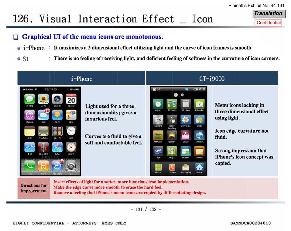
Ironically, two of the points express how Samsung should copy the iPhone’s design, while a third notes that an effort should be made to avoid looking like they were copied. In short, copy the elements which make the iPhone stand out, then change the appearance enough so that it doesn’t look too blatant. Copy but don’t look like you’re copying. Little wonder Samsung lost in the U.S. case, and yet telling that it didn’t lose in Korea, not to mention elsewhere.
 As a result, when one sees someone holding a cell phone nowadays, one often has to look carefully to determine whether it’s an iPhone or something else. Admittedly, the Galaxy S III is visually different to a greater degree, although I was chagrined and amused to discover that in my initial viewing of the ratings list I had mistaken the S III for another iPhone. Seriously.
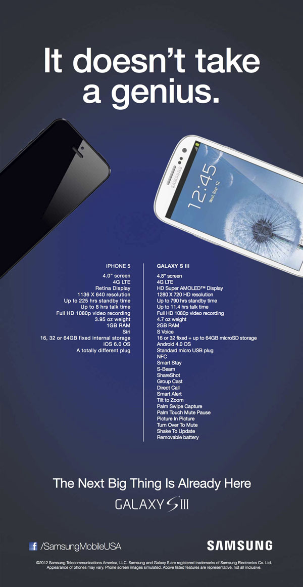
Samsung also went on the offensive with an ad showing how much better the Galaxy S III is than the iPhone 5, at right (click for the full-size version). One may note that they used differently colored phones, and keep the iPhone off while the S III is on. I confused the two in the ratings list because both were black and shown activated. I don’t think it was a random choice to show them that way in this ad. It would have looked a lot worse for Samsung had they been side-by-side, both the same color, and both turned on.
The ad made these comparisons:
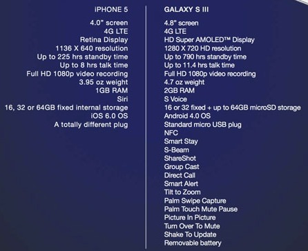
Samsung actually has some points here, but to a knowledgable observer, it’s clear that they’re not going for actual advantages, but instead are aiming to pad the list.
The screen is one point of difference, but is listed three times. The S III has a 4.8“ AMOLED screen at 1280 x 720, whereas the iPhone 5 has a 4” Retina screen at 1136 x 640. The final point—the resolution—is the only significant difference in most cases. People like big screens, but they also like small profiles. AMOLED gets you better contrasts and deeper blacks with lower power consumption, but Apple’s display has been rated as the best-quality in a broader range of points. And in the end, few will notice the difference in resolution. Advantage goes to the S III in most cases, but not by much.
Another three points are about the battery. The S III has more standby time. However, how many people let their phones remain idle for more than ten days? How many don’t recharge every day or two? Samsung brags about battery life in use; in some tests, the S III’s battery lasted longer, though nowhere near as much as advertised. These running times vary, and the advertised times are based on settings at minimum, which do not reflect real-world use. When the screens are set to maximum brightness and LTE is used, in fact, the iPhone 5 battery actually lasts longer than the S III. In normal use, the battery is more or less a wash. The only significant difference comes with the point Samsung moved to the end of the ad: replaceable batteries. If you find yourself forgetting to charge at night, or are such a heavy user that you run out of battery before you get home, this can be a huge difference (albeit a greater cost), but most people don’t need it. Advantage goes to the S III, but again, not by much.
The Samsung has 2 GB or RAM compared to 1 GB on the iPhone 5. An advantage, but then again, Android uses more RAM, making it more of a wash. Currently, the iPhone 5 runs perfectly well with the 1 GB, making the difference meaningless. However, in a few years, the new OS versions and software will tax that 1 GB. Advantage goes to the S III; by how much depends on the actual RAM requirements of software used. It should be noted that some variants of the S III only have 1 GB, however.
The real advantages of the S III are the removable battery, the ability to use SD storage in a meaningful way, and the larger screen, for those who like that and are willing to put up with the disadvantages involved (increased size and weight, less battery life). NFC is a possible advantage, depending on whether or not you can use it.
Some points are a wash; both do 4G LTE, both record 1080p video. The OS (iOS vs. Android) is a matter of preference.
Other points? Apple wins on weight and dimensions. You might note that Samsung “overlooked” the physical dimensions. The iPhone 5 is notably smaller in all three dimensions: 4.87 x 2.31 x 0.3 inches (123.8 x 58.6 x 7.6mm) for the iPhone 5, and 5.39 x 2.80 x 0.34 inches (137 x 71 x 8.6mm) for the S III. If you give the S III points for screen size, you have to give points to Apple for profile. Advantage goes to Apple, depending on preference.
Samsung’s ad also notes Siri, pitting it against Google’s “S Voice.” According to those who have used both, Siri wins hands-down.
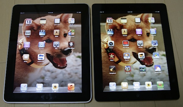
Amusingly, Samsung touts their own “Standard micro-USB plug,” while calling Apple’s connecter “a totally different plug.” After having used it, I must say I love the fact that you can plug it in either way; I used to struggle with directionality a lot, and still do on the iPad. It’s a pain when you’re doing it just as you’re falling asleep, for example; it wakes you up. True, Apple is hogging all the revenue for the new connector, denying cheap copies to be sold for a while. But Samsung’s main charge, that it’s different, is bogus on the fact that Samsung has changed their own connectors more than a dozen times in the past 10 years; this is the first time Apple has change the plug in a decade. I would call this a wash.
After this in their ad, Samsung then proceeds to list 14 different features presumably unmatched by anything Apple has. As noted above, only two are significant: the NFC and the removable battery. Almost all the rest are specific features residing in a category which, if honestly compared with the iPhone, should allow for dozens more Apple features to be mentioned. I mean, really, “Tilt to Zoom”? “Turn Over to Mute”? Many of these are trivial at best.
How about iCloud built in? Shared photo streams? iMessage allowing texting to expand to other devices? Airplay video streaming? Find my iPhone? Apple’s VIP Mail feature, or “Do Not Disturb”? Facetime? These don’t count? Apple’s 700,000 apps don’t count? (OK, maybe 100,000 when you subtract fart apps. Ditto for Android, though.)
Then there’s security. Even with a jailbreak (which cancels out many of Android’s advantages), the iPhone is likely to be more secure.
Then there’s the hardware. Samsung uses plastic; Apple uses metal. I have never liked the cheap plastic feel of so many phones (including when Apple used it), and much prefer the more solid construction. Both use glass, but in drop tests, Apple fared far better than Samsung.
When I have been able to get my hands on an Android phone, I always test the touchscreen. Apple is noted for having the best sensitivity and fine control, and it shows. Relative to using the iPhone, I have trouble using screens of competing phones, and have seen the owners of these phones experiencing the same difficulty.
I have wanted to do a side-by-side with the S III, but ran into another difficulty: I couldn’t find anyone who had one. It made me wonder if it had come out already, but yes—it has been out since May.
And that’s what it really comes down to: preference. And back to: sales. See the ratings list I started this post with. Apple is hands-down the winner in terms of popularity.
One thing that I regularly do when I ride the train is to try to note cell phone use. In Japan, at least half the passengers are using them, or so it seems. When I do a count—how many are using the iPhone versus any other phone—I regularly come out with about the same result: about half the phones I see in use are iPhones. That’s versus every other maker combined.
In a country where the iPhone was supposed to be an abject failure, that’s saying something.

 If you ask me,
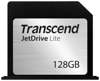 There’s a spiffy Mac accessory, a 128 GB SD card from Transcend that sticks into your SD slot and doesn’t stick out. I’d love to get it, as my 256 GB SSD is just too small for me.
 They make a big deal about the thickness being 14mm, which is thinner than the Air at its thickest (the Air ranges from 3mm to 17 mm)—but what they fail to mention is that with the keyboard, it’s thicker. The “Touch cover” (a keyboard with little tactile response) is 3 mm, putting the fully-outfitted Surface at 17 mm, or exactly as thick as the thickest part of the Macbook Air—but the Surface is the same thickness all over, making it bulkier the air. Choose the 6mm “Type Cover” for Surface (which most people will prefer), and it becomes much thicker and bulkier than the Air. The weight is “under two pounds,” but again, with the keyboard, that will inflate, probably making it about the same weight as the Macbook Air.