
iWork ’08, Part 1 (Overview, Keynote, and Pages)
 With the newest release of their “Office” software suite, Apple has finally fulfilled the potential everyone has been expecting since Apple released their presentation software, Keynote, in early 2003: to replace MS Office on the Mac. Apple’s word processing software, Pages, followed two years later, in early 2005, and–as if on a 2-year schedule–Numbers has now come out in iWork ’08. Now that all three apps are part of the deal, Apple’s iWork suite can now be billed–for some–as a full-out replacement for MS Office. It’s not for everybody–but it is a potential replacement for most Mac users. One of the biggest draws will be the price: $80 for the whole suite, as compared with up to $400 for the same set of apps in MS Office Standard Edition.
Aside from the much lower price, it is also a much simpler choice: MS Office has the usual dizzying array of “versions” that make it hard to understand what exactly you’re getting. For example, why is “Home and Student” $150 when “Standard” is $400 and the big difference is that “Home and Student” has “One Note” and “Standard” has Outlook? Is Outlook worth an extra $250? But even at the dirt-cheap $150 price for the Home and Student version, Apple’s iWork ’08 is almost half of that price–more than half that price for the Student version (at $71).
MS Office is worse if you are in Japan: there is no “Home and Student” version here. There is a “Personal” version with Word, Excel, and Outlook (no PowerPoint) for �42,000 ($354); to get PowerPoint, however, you need the “Standard” version, the same as in the U.S., which is priced at �48,500 ($410). And they are in Japanese only–you cannot change the language to English, at least not without special tools. In contrast, iWork, like all Apple software, comes “localized” in more than a dozen languages, changing automatically whenever you change the language of the OS (another thing you can’t do in Windows).
But can iWork really replace Office? The answer depends on how much of a power user you are. For example, do you know what a pivot table is, or do you ever use such a thing? How about cross-referencing in a word processing app? If you depend on relatively esoteric power tools in office suite apps, then iWork will not work well for you. For good or for bad, Apple has aimed this suite squarely at non-professional users–“the rest of us,” as it were. But if you don’t use these highly advanced features, then you’ll find iWork can work very, very well for you. It will produce slicker documents more easily, and still have a lot of features you’ll never get around to needing.
One potential drawback: if you’re used to using Microsoft Office, you might run into the same problems many switchers have: running in “Office” mode, expecting iWork to work exactly as you have expected Office to work. Just as Windows users grouse about how the Mac OS doesn’t do things the way they’ve come to expect in Windows, iWork will also take a bit of re-training. But your troubles will not come from switching to a badly-designed app; instead, it will be because you are switching from a poorly-designed app to a better-designed one. Certainly this is true in Keynote; whether it is true in Pages is a bit more debatable.
All right, let’s take a look at what’s new in the iWork suite.
First is Apple’s oldest element of iWork, Keynote. With Keynote ’08, the fourth major revision of the software, Apple’s presentation package feels a lot more mature. Like all of the iWork suite apps, it does not have the minute controls of its MS Office counterpart, nor the myriad little features and effects with as many options. What it does have is pretty much everything you need to use, in a simpler, slicker package, and with effects and presentation features that make your slide show look a lot nicer than Office can make it look. There’s a lot more “Wow” in Keynote than there is in PowerPoint. A lot of it comes from the slick animation and transition effects.
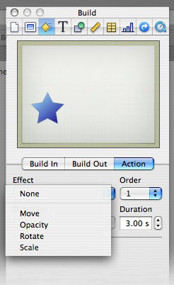 Those effects get a big boost with one major new feature in Keynote ’08: Actions. An action is an advanced form of animation based upon movement, scale, rotation, or opacity. These effects can be used separately or in combination; for example, you could have a photo that starts at point A and moves to point B, and as it does so, it rotates, grows smaller, and fades out all at the same time.
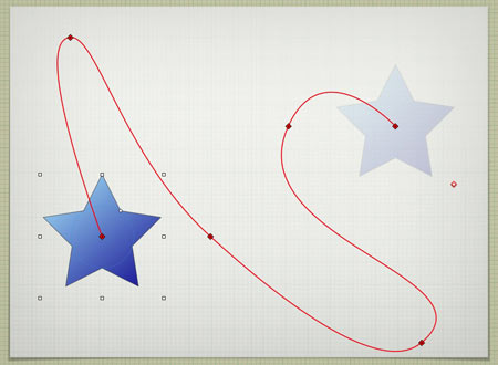
The most fun is the “Move” feature; you can use bezier points to assign a complex path made up of straight lines, corners, and curves. As you can make the object change size, transparency, and angle at any point along the way, you can have some fun making your object dance around as you like.
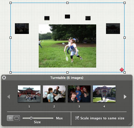
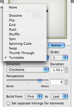 Apple used this new feature to create more complex bundles of actions, called “Smart Builds.” There are ten such, and they essentially are different ways to view more than one image based upon complex animation techniques.
Included in the “Smart Builds” are a spinning cube with a different image on each side; a turntable (a la Front Row) where images take a turn rotating to the front; a “thumbing” effect which simulates photos being shuffled from front to back as if by hand; and many more.
Each build has a number of options, and, as is usual with iWork apps, it’s dead-easy to generate the effect.
Another new feature that has been added to the whole suite is something called “Instant Alpha.” Essentially, it is the ability to make a certain color disappear, but a bit more advanced. If you have an image where a background is mostly one color or range of colors, and the foreground element is a different color/range, then you can (usually) make the whole background disappear. Just drag a circle around the colors you want to make disappear, and they get blanked out.

You can perform the same technique several times in one image, and the areas to be blocked out are highlighted dynamically, letting you ease off or push forward as is needed. Two problems, however: first, selections are only made contiguously, so if you have lots of small pockets of color to make disappear, then your task becomes a lot harder (see the bird in the image below, and how I missed some of the white sky behind it in certain places); and second, the effect only works well on a small number of photos, such that you have to almost take specific photos designed to work well with the effect. See three different images with varying levels of success below:

Next is Pages. There are some much-needed new small touches–for example, added shapes no longer appear automatically inline with the text; that glitch caused a lot of confusion for a lot of people. New objects now appear as floating, allowing you to move them outside the margins, with the option to make them appear inline if you wish.

A much more significant addition is the formatting toolbar, putting the most important editing tools where you need them, instead of having to hunt them down in the inspector, or conjure up the Font palette. Shown above are the three variations depending on context–text, tables, and objects (click for full view). That makes it not only a lot easier to format, but it also makes it easier for people switching over from MS Word. One remaining complaint: the lack of WYSIWYG font menus. Yes, the Font palette will give you some WYSIWYG, but only in the “Favorites” and “Recent” views… and I never liked the Font palette anyway.
Other changes are a bit less than stellar, but still useful. There are now separate modes for layout: “word processing” and “page layout.” The first works like a standard word processor–type within the margins. The second is more like using a professional layout program like InDesign, in that it relies on text boxes instead of the standard typing paradigm. These different modes were both possible before, but here they have been better defined and separated, with templates made for each mode.
Pages ’08 also allows for change tracking, showing what was changed in a document and when–more useful for collaborative office situations, though I could see it as potentially useful for writing essays as well. Change tracking is one of those very popular high-level features that most people don’t use, but enough have demanded that Apple has included them–like Mail Merge, which was added in Pages 2. There are also new graphic tools, such as picture frames, the above-described Instant Alpha, and other image-handling tools. Most are slight, cosmetic changes that may or may not be useful to different people.
Aside from that, Pages is pretty much as it always has been. It’s now a bit more easy-to-use, and a bit more flexible. I still have not made the complete switch to Pages from MS Word, however, in large part because of the remaining accessibility issues regarding font formatting–namely, the messed-up interface regarding the Font palette. I tried to get around this with keyboard shortcuts, but Apple has not implemented that feature as well as I would have liked. It works well for commands in the main menus, but any command in a pop-up menu will not allow a keyboard shortcut to work unless the pop-up menu has first been activated. Which kind of defeats the purpose of a shortcut.
But that reason is highly specific to me; Pages should work fine as a primary word processing program for most everybody–and despite my foibles about the Fonts palette, I could certainly be happy using it if I really wanted to shove Microsoft out of my life. As it is, I use Pages half the time, and MS Word half the time.
Both Keynote and Pages are nominal upgrades, not complete reworkings of previous versions. Both apps have been inching forward, adding useful new tools and features with each new version–never so much that they become feature-bloated like MS Office apps, and always keeping focus on maintaining the Apple design paradigm of slick-but-simple (for better or for worse, depending on your point of view).
The real new change, however, is Numbers… and I find myself running both long in column space and short of time. So a review of Numbers will come soon. In short, however: Numbers fills out the suite and lets you leave MS Office behind–again, so long as you’re not a power user dependent on Office feature-bloat.