
Lies that Forbes Told Me
I avoid the Forbes site like the plague. Not only do they indulge in click-bait and are aggressive in their advertising and anti-privacy tracking of you, but their bias is even more pronounced than the Wall Street Journal’s, and that’s saying something. Still, I do use Facebook, and so I get Forbes thrown in my face anyway.
A recent lie: Seattle’s decision to boost the minimum wage has resulted in an increased unemployment rate. The Forbes hack author shows this chart, and then comments:

As you can see we have a fall in the number of people employed in Seattle since that higher minimum wage began to bite. You should go see Perry’s post as he’s got three different charts and all three of them are telling us much the same thing. There’s fewer jobs, the unemployment rate is higher and the number of unemployed is higher. The combination of those three means that it’s not a change in population size driving this: it really is that more people who would like to have a job don’t have one.
Wow. That seems pretty iron-clad. I mean, look at that chart! And the ones at his source! The numbers go way down right after the wage hike! Hard to argue with that! And he said that it’s not because of population change, so that pretty much nails it, right?
Sure—if you don’t look too hard or try to find the facts out for yourself. Like I did, when I went to the BLS site and got all the data for myself.
The first thing I noticed was that these people used only the numbers for the city of Seattle, and not for the metropolitan area. That’s dishonest: many people who work in Seattle live in the surrounding areas. So I got the numbers for the metropolitan area, not just the city.
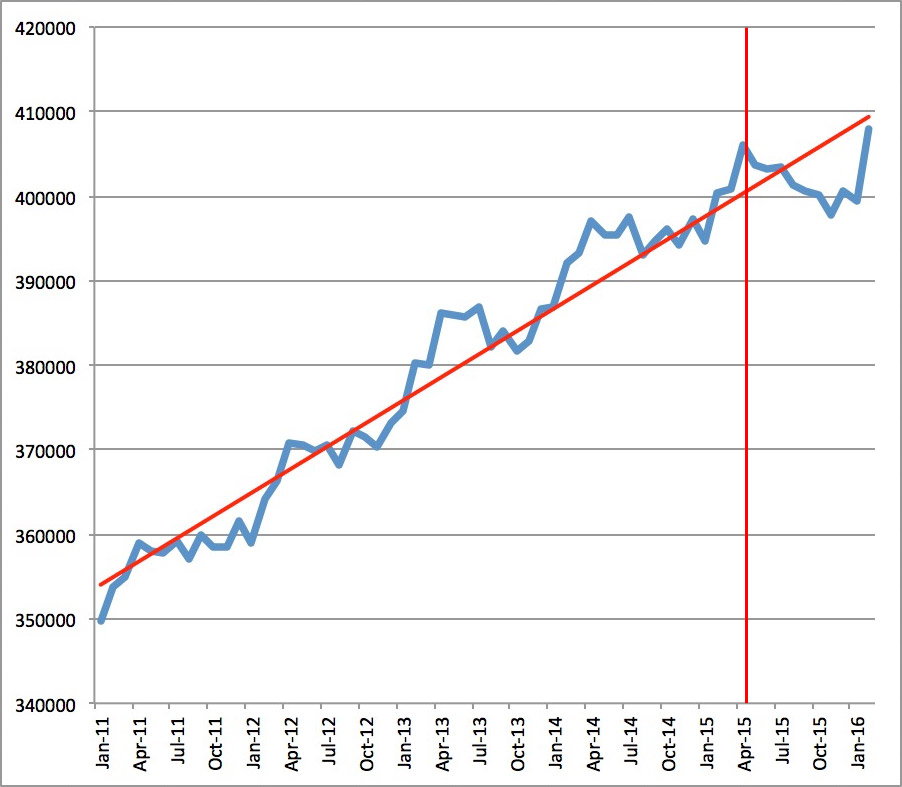
Here are the stats for the Seattle metropolitan area between April 2015 and December 2015, the numbers cited in the article:
| Labor Force | Employment | Unemployment | Unemployment rate | |
|---|---|---|---|---|
| 4/2015 | 1,971,701 | 1,887,637 | 84,064 | 4.3% |
| 12/2015 | 1,983,893 | 1,884,635 | 99,258 | 5.0% |
| Change | +12,192 | -3,002 | +15,194 | 1.0% |
Hmm. First glance, he seems to have a point: employment dropped by 3,002 jobs. The minimum wage hike got three thousand people canned! Holy cow!
Let’s look at the chart showing the long-term numbers for Seattle, city only (so it matches the data he shows you):

The red vertical line shows when the wage hike went into effect. Hmm. When it started, a peak. At the time of the article, a drop. So, the Forbes guy is right, yes?
No.
This is what you could call a “temporal lie.” It takes a very small segment of time in a volatile data set where there are many short-term variations up and down, and tries to claim that the short-term volatility somehow represents a long-term trend.
Notice on the chart that there was a huge spike just before the wage hike. Notice that there was a drop just before that, and there were similar spikes every year. Oh, hey! Look! A pattern! Every year, in April, there are spikes! And every year, around December, there are drops!
Let’s look at that!

Hey! Who would have thought?! Every April, there’s a bump up, every winter the numbers drop. And, conveniently, the Forbes hack author uses that exact time frame to tell us that the variation is due to the minimum wage drop! Wow! I’m sure that it never occurred to him, because to be a Forbes author, you have to be a completely blind idiot!
Well, I suppose you can excuse him on a few accounts, like (a) he’s biased, and (b) his source is the American Enterprise Institute, a heavily biased right-wing think tank, and (c) the AEI’s chart is built in a way to disguise these yearly regularities unless you look really hard.
So, we now can see that April is usually high and December is usually low. According to the pattern, we should see numbers jump up again in early 2016.
Fortunately, I can show you this, because the article was published two months ago, and we now have two more months of data. And lo, look at what happens:
| Labor Force | Employment | Unemployment | Unemployment rate | |
|---|---|---|---|---|
| 4/2015 | 1,971,701 | 1,887,637 | 84,064 | 4.3% |
| 2/2016 | 2,019,459 | 1,912,335 | 107,124 | 5.3% |
| Change | +47,758 | +24,698 | +23,060 | 1.0% |
And jeez, will you look at that. Numbers jumped in February. What do you know. Here’s the updated chart, again limited to the city of Seattle:
If the trend follows the usual yearly pattern, then we should see the numbers for March and April increase even more, sticking to the previous trend line, and thus prove wrong the assertion that Seattle is suffering because of the wage hike.
Looking at the whole actual numbers in a larger context, we can see that in fact, Seattle is doing great!
What they’re doing here is playing on a common illusion in charts: base your claim on a very small part of a trend line and claim it’s proof of something much bigger. It’s what conservatives did with climate change data.
It’s what they do: lie with numbers.