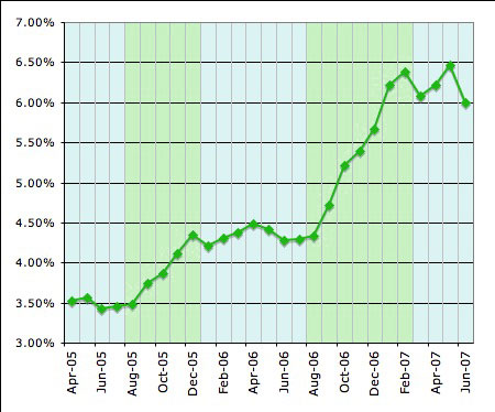
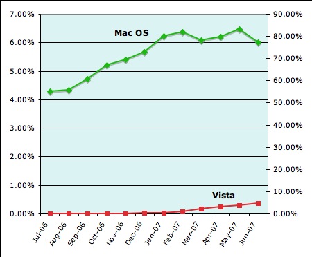
While the new Leopard seems to be a snazzy new OS with some very cool features, it unfortunately suffers from overly high expectations, and Steve Jobs can only blame himself for that. When he announced that there were “top secret” features that had to be hidden from Microsoft so they wouldn’t copy them too early, people took him at his word, and expectations were sky-high. Windows apps run native on the Mac OS! A brand-new, world-changing windowless interface! A completely reworked Finder with 3-D animation everywhere! Something new and mysterious and unexpected and amazing!
Ummm… well, not quite.
The thing is, Leopard is cool. Stacks, QuickLook, Coverflow–the Finder has been reworked. But these don’t really seem like “top secret” features that had to be hidden for ten months so that Redmond wouldn’t copy them. A lot of it was in the name Jobs used last year–“top secret.” If he’d just called them “extra features,” then expectations would not have been quite so high. The long wait has also been partly to blame, and ironically, the early preview last year spread out the news a bit too thinly. Had all these features been released at once, it would have been as satisfying as any Mac OS release, maybe even more.
But here’s another bit of irony: while most of the “top secret” features that needed to be hidden from Microsoft are indeed new… enough of them are reminiscent enough of existing Windows features as to actually be a bit embarrassing in light of their having to be hidden so Microsoft wouldn’t copy Leopard. Ulp.
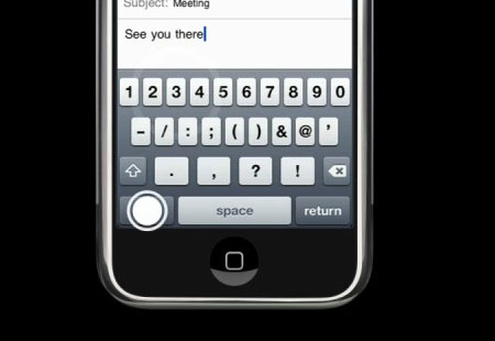
In any case, the “top secret” feature was… a new Finder. A lot of people expected that. Let’s take a look at the details. Quite a bit is eye candy, but most of that is as irrelevant as the new eye candy in Vista. There’s the new Dock with the “floor” which reflects not only the icons in the Dock, but even windows that get close to it. There’s a semi-transparent Menu Bar which in itself is reminiscent of Vista’s semi-transparent window frames. This is not so exciting.

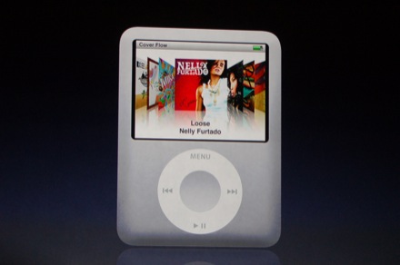
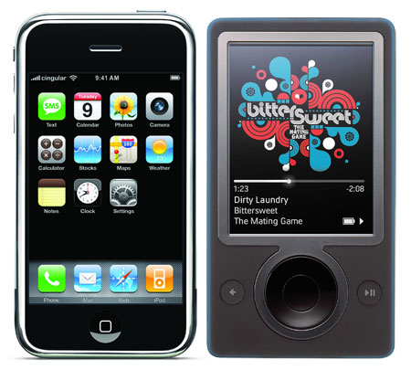
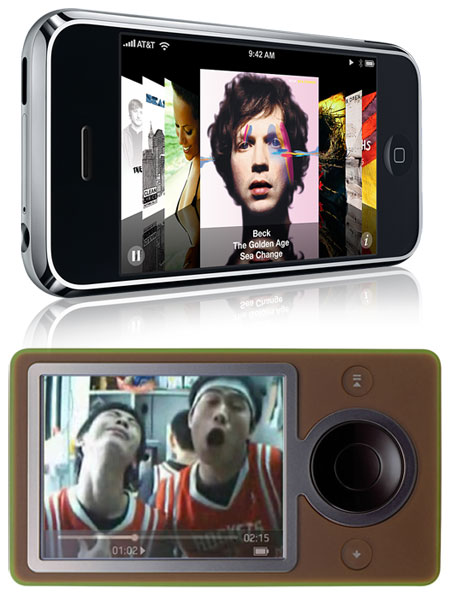
The interesting stuff comes with functionality, and that has been improved. Interestingly, just like Windows 98 integrated Internet Explorer into the OS and made its windows act like web pages, Apple has done a similar thing, but this time iTunes was the model. The windows in Leopard not only sport the same non-brushed-metal look-and-feel, but the sidebar has changed to fit the iTunes theme–and even CoverFlow is now integrated. You know, that new iTunes thing which makes album covers flip by in 3-D.
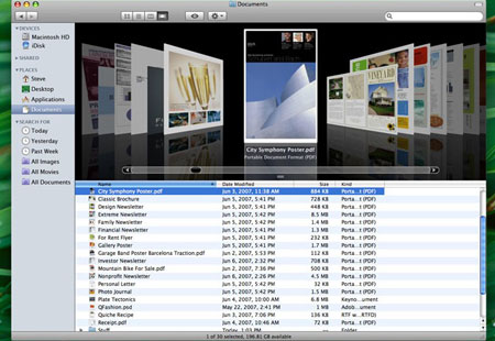
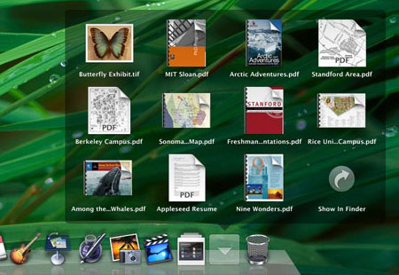
I was never excited by CoverFlow because it’s so hard to get album cover art for all of my archived music, so most of my “covers” are just blank. But that should be different in Leopard’s Finder, mostly because of another new Finder feature: QuickLook.
QuickLook is another feature which is a bit reminiscent of Windows. In Windows XP, a lot more documents were available as previews in icon form than were available on the Mac. Web pages are one example; they would render in miniature in the icon in XP, something that Tiger would not do. The Mac could preview images and movies, but not much else. So XP was ahead in that minor respect… and now the Mac is.
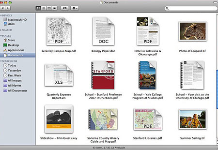
Leopard takes document preview to an almost ridiculous extreme in the files it previews. It allows thumbnails of every kind of document… or so we are led to believe. The demo only shows images, PDFs, movies, and iWork & MS Office files. How other icons will render is unclear–for example, how about a FileMaker Pro database file? A DiVX movie? Even a folder? They didn’t show what a folder would look like in QuickLook. I suppose that this is stuff we’ll hear a lot more about very soon as Leopard will be open to more public scrutiny now… but the omissions worry me a bit.
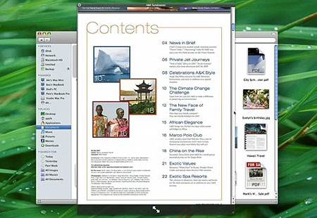
But thumbnails are just the beginning of QuickLook; the real magic is the ability to preview files, full-size, without opening the application. just select an icon, tap the space bar, and it zooms up to show you not only the top page/image, but the whole file, which you can go through page by page, slide by slide, without having to wait for the app to open. A very nice, time-saving feature to be sure.
Again, the $64,000 question is, will QuickLook work on all documents, most documents, or just a limited set? Can developers update their apps so as to be QuickLook-friendly? What are its limitations? Stay tuned.
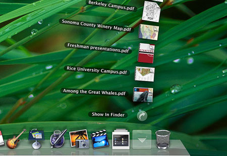
Another new Finder feature is one that has been rumored for many, many years: Stacks. And while this is a cool feature, from the demo it looks like the feature is limited to the Dock, which therefore limits the number of stacks you can have before your Dock becomes ridiculously tiny. But in concept, it’s a snazzy addition, and even in limited fashion, it could be a bit useful. The idea is essentially a way to get multiple-file QuickLook in the dock, probably not feasible in the boring pop-up menu form used now. Instead, a stack will display either as an arc of icons spread out, or as a dark Spotlight-themed preview pane:
The final big new Finder feature is called “Back to My Mac.” This is part of the new shared-folder improvement, which allows the new Finder features to be used even when browsing files on other computers. Hopefully, they’ve improved on that general feature as well, and when a shared folder is removed before being ejected from the Finder, it won’t freeze the OS for two minutes like it does now… hopefully. They also included a “Share Screen” feature in shared computer finding, which presumably allows full remote access of the other Mac, seeing what their screen sees, just like was advertised in the new iChat.
But the “Back to My Mac” feature is kind of nice… if you have the $99/year .Mac service. Yep, another new feature that’s exclusive to that annoying paid service, which is loaded up with a myriad of marginal features that almost make it worth it to buy into, but not quite. “Back to My Mac” certainly fits that concept. It is kind of neat, actually–every time your Mac devices get a new IP address to connect to the Internet, that address is updated in your .Mac account so that you can always access your Mac from anywhere you can access .Mac on another Apple computer.
But sometimes features lay in waiting, almost capable and prepared, their potential hidden within established hardware and software… so they can jump out at you without warning. Sort of like what rental movies would be for the Apple TV. The “Back to My Mac” killer feature that I see coming down the road: access your remote files via your iPhone. Your iPhone won’t have to have much storage, because you could just connect to the Internet from your iPhone and access your Mac at home, just like that. Now that would tip .Mac into just enough relevancy to be worth a hundred bucks a year.
Another possible hidden potential is one of the unmentioned points of the keynote: iLife and iWork. There is always the potential that the apps in these suites could be made to work with the iPhone, furthering the mobile’s productive potential. But since none of these apps were even mentioned in the keynote, we’ll have to wait and see.
So of all the new “top secret” Finder features, some are just eye candy (the new Finder appearance, iTunes theme, CoverFlow, Stacks) and some are true productivity-enhancing features (QuickLook, Back to My Mac).
But here’s the real question, and one that will hopefully be answered soon: did they really Fix The Fracking Finder? Did all of those little annoyances get worked out? Did “View Options” get consistent? Will window-resize work properly now? Stuff like that? Or did we just get a few new features tacked on without a significant rewrite? We’ll have to wait and see–Jobs didn’t talk about those things, either because they were not big “features” or because they didn’t happen.
A lot of Leopard’s new feature set was under the hood as well. Core Animation still looks to be a big draw, and 64-bit compliance is very much improved for better performance.
There is also a lot more to be seen in Leopard that wasn’t shown, like how SpotLight has been improved. Do they allow searching by size, or sorting by it? That would be a nice addition. Another thing to wait for in the coming days, unless Apple has still clamped down on reporting users’ experiences as much as they have until now.
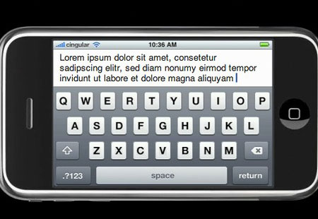
But the new Finder isn’t the only news. Safari also made some headlines, most notably because it’s now ported to Windows! How well it will work there, and how it will stack up to FireFox and Explorer 7 is another question. It’s now up to version 3 (beta), and has many of the new features touted last year, including text field resizing, re-arrangeable tabs, and inline search. It now claims to load things twice as fast, and it does seem to be true.
Safari 3 for Windows may also be a nod to the iPhone being released, as the iPhone uses Safari a lot–not just for browsing, but also for application support. In fact, while Apple opened up the iPhone to 3rd-party apps, they hedged on the security issue by making them run through Safari; the Windows release of the software may be tied into that issue, as well as being an attempt to challenge Explorer in the browser war. With interoperability between Apple apps and its cool new accessories, Apple could gain quite a bit of ground.
However–and this is a really big “however”–I will probably be uninstalling the beta version 3 I grabbed this morning, and going back to version 2 in a few days, despite how much I really love the tabs and the text field thing. Why? PithHelmet is disabled. That’s a huge thing for me. Once I installed version 3, I realized how much I’ve been taking PithHelmet for granted, as all of those goddamned annoying little ads and flashing images came back with a vengeance. I never realized how much they had proliferated, since PithHelmet had been blocking them so faithfully.
So until PithHelmet version 3 comes out, I’m sticking with Safari 2. But I will definitely see to it that Safari is installed on the school’s XP computers, and see how the students like it–not to mention that I’ll check out for myself how it performs on Windows.
Other Leopard news: Fast-switching in Boot Camp. Instead of fully rebooting between the two systems, Boot Camp now allows for “Safe Sleep” on the Mac and “Hibernation” on Windows–essentially saved states of the systems which allow for leaving apps running and windows open, and switching more quickly between the two. Not the Parallels-killer some were expecting, but a nice improvement for a free OS component.
Other than that, most of the features are already known: Spaces, Time Machine, and upgrades to Mail, iChat, iCal, Automator, and a few more.
One thing that was not made fully clear: some are reporting that we now know Leopard’s “full” feature set… while others hint that other features still remain hidden. So what’s up? I don’t think that Jobs even mentioned the whole “top secret” thing… and although it’s a long shot even to the point of being a pipe dream almost, is it possible that we have yet to see all that Leopard offers? Will there be more?
Two notable omissions from today’s keynote: iLife and iWork. There are always upgrades to those with a new OS, and yet not a peep from Jobs about these two. That so far is the biggest hint that there is more to come, unless Apple decides to release the new versions of both suites at a later time, like at the Macworld ’08 in January next year.
Or possibly were there features that Apple hoped to include but couldn’t make it to the final cut? Maybe Apple suffered from the same problems Microsoft saw in Vista, having to cut what they wanted to add, but Apple benefitted from its secrecy. Maybe Apple is unsure how the iPhone’s keyboard will work with the general public, or there might be other issues they could make work quite yet that would hold back the release of these apps. We may not know, at least not for some time.
But as we see it now, Leopard will, without question, be worthy of the $130 price tag, and will definitely be worth the $70 price tag I’ll get as an educator.


 Another element in Numbers is the automation of headers within the table. Click on one of the three “Headers and Footer” buttons and your table will acquire a row at the top or bottom or a column at the left, all of which will stay rooted there no matter how you change the table. Names assigned in these areas will automatically be grabbed by any chart you create.
 Another nice touch is the addition of a sample function preview just below the styles. If you select multiple cells with data in them, the answers to various function equations appear in this area. This also happens in Excel, but this is something which most Excel users, including myself, do not notice even after years of use–because the design of Excel makes this feature very hard to see. This is an excellent example of the importance of design; everyone who uses Numbers sees this almost immediately. What’s more, you can use it as a formula shortcut: after selecting the range of cells you want to use a function for, just drag and drop the function from this area onto the cell where you want a formula to appear, and it does (this extra touch is not possible in Excel, by the way–at least not Excel 2003).


 With the newest release of their “Office” software suite, Apple has finally fulfilled the potential everyone has been expecting since Apple released their presentation software, Keynote, in early 2003: to replace MS Office on the Mac. Apple’s word processing software, Pages, followed two years later, in early 2005, and–as if on a 2-year schedule–Numbers has now come out in iWork ’08. Now that all three apps are part of the deal, Apple’s iWork suite can now be billed–for some–as a full-out replacement for MS Office. It’s not for everybody–but it is a potential replacement for most Mac users. One of the biggest draws will be the price: $80 for the whole suite, as compared with up to $400 for the same set of apps in MS Office Standard Edition.
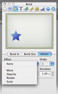 Those effects get a big boost with one major new feature in Keynote ’08: Actions. An action is an advanced form of animation based upon movement, scale, rotation, or opacity. These effects can be used separately or in combination; for example, you could have a photo that starts at point A and moves to point B, and as it does so, it rotates, grows smaller, and fades out all at the same time.
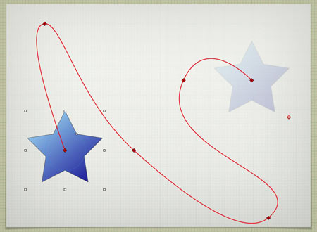
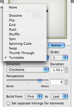 Apple used this new feature to create more complex bundles of actions, called “Smart Builds.” There are ten such, and they essentially are different ways to view more than one image based upon complex animation techniques.
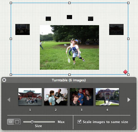


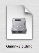
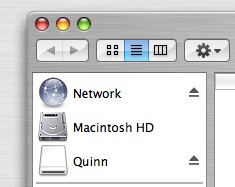
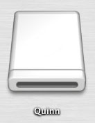 When you open up the disk image file by double-clicking on it, another icon appears on your desktop, which usually appears like the image at left. It does not matter where the original “dmg” file is on your computer, the new disk icon will appear on your desktop. It also will show up in the left-hand sidebar in any open Finder window, along with your other physical disks (see right). At this point, it is acting exactly as if you attached a hard disk or popped in a DVD; it does not act like a file on your computer, but like an attached drive. Note that you can see both the “dmg” file and the virtual disk which came from it at the same time.

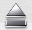 Small detail: there are three ways to eject the virtual disk. One: click the virtual disk icon on the desktop and type “Command-E” (which also will eject any other kind of disk which is selected). Two: go to the sidebar in an open Finder window and click the “eject” icon to the right of the disk’s icon. Or three: drag the virtual disk icon from the Desktop to the Trash–which, as you’ll note, transforms into a metallic “Eject” icon in this instance.